

Geoscience
Brand & Identity, Collateral Materials, SWAG
Project.
The Winona State University Geoscience Department needed a campaign to help increase enrollment and interest in their major and minors. The department already had branding, but was unhappy with their current logo and tagline. They came to us looking for suggestions on how to best promote their department and advertise all that it has to offer to current and future students. It was our job to research, develop, and design solutions that would best solve their current problems.
Solution.
In my team’s solution, we knew that simply having a new brochure was not going to produce the results that the client was seeking. They needed more than that, so we proposed that the best way to reach new and current students was ultimately through a combination of both physical materials and social media. In order to have a lasting impact on students, they also needed to have a more solidified brand identity. Although this was not our main goal, creating branding was another step that needed to be taken in order to have a more significant presence on the WSU campus. In our proposal we offered new solutions including updated branding, a redesigned brochure, a social media strategy, and a few swag items to get their new brand identity out there. Finally, we also included photo examples that were taken when we visited their classrooms and attended a lecture to better understand the program offerings.


Geoscience Logo Development
During our initial brief, we gained a better understanding of what the client wanted from a logo and branding. It was clear to us that representing the Winona area was going to be a crucial part of creating something the department was proud to call their own. Because of this, our final direction follows a direct link to the Winona area’s classic bluff scenery while still using simplified and organic outlines.
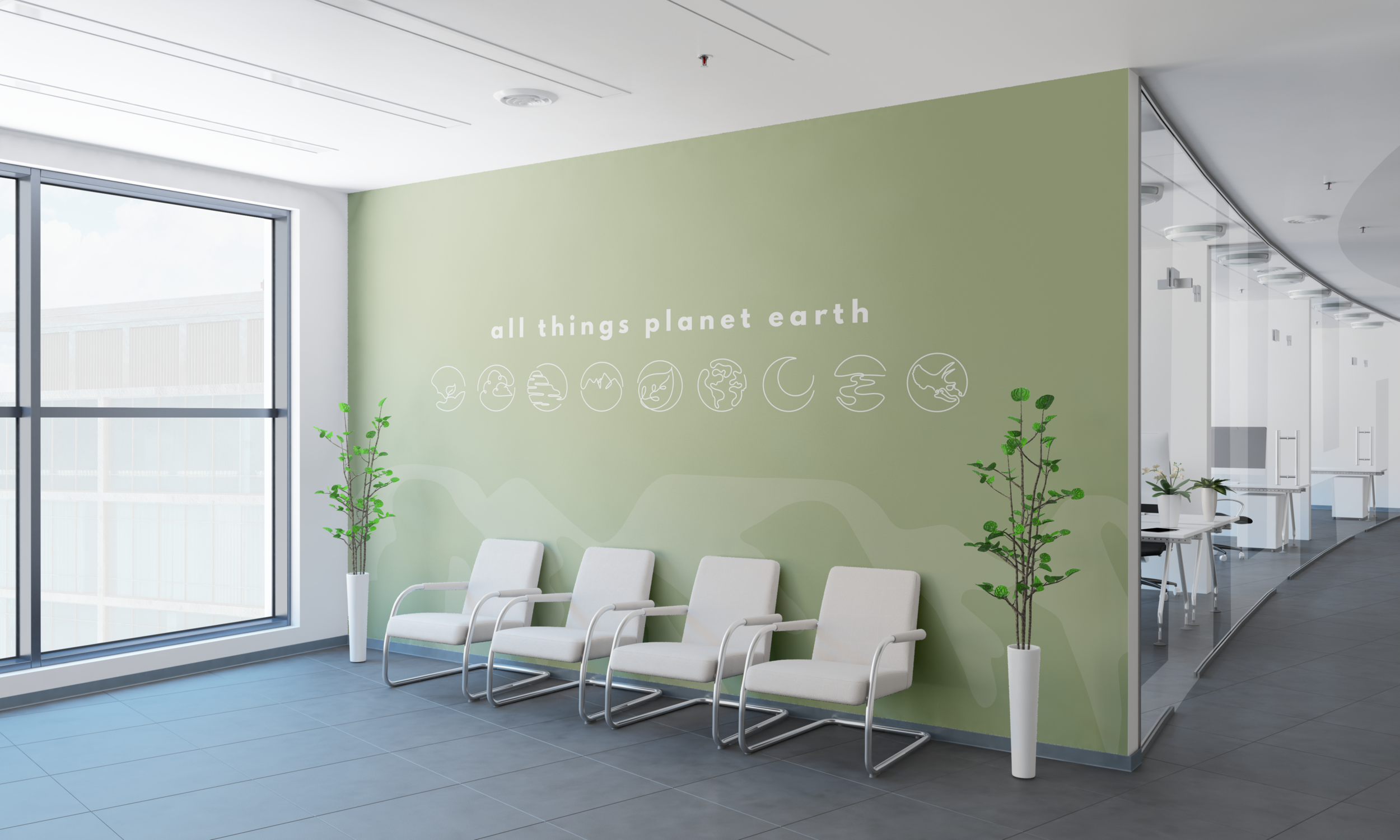

Geoscience Icon Set.
The essential need for a simplified main logo inspired the idea to create this set of icons. Initially, the set included imagery of river, sun, tree, rock, leaf, volcano, the moon, and the world. Based on the client mid-review, I worked with them to change several icons to what better represented the diversity of the geoscience department. Once everything was updated, the icons that were chosen were plants, clouds, rock, mountains, leaves, the world, the mood, a river, and a fossil.